Hauntii's Style
This game's current style almost all originated from this one sketch:
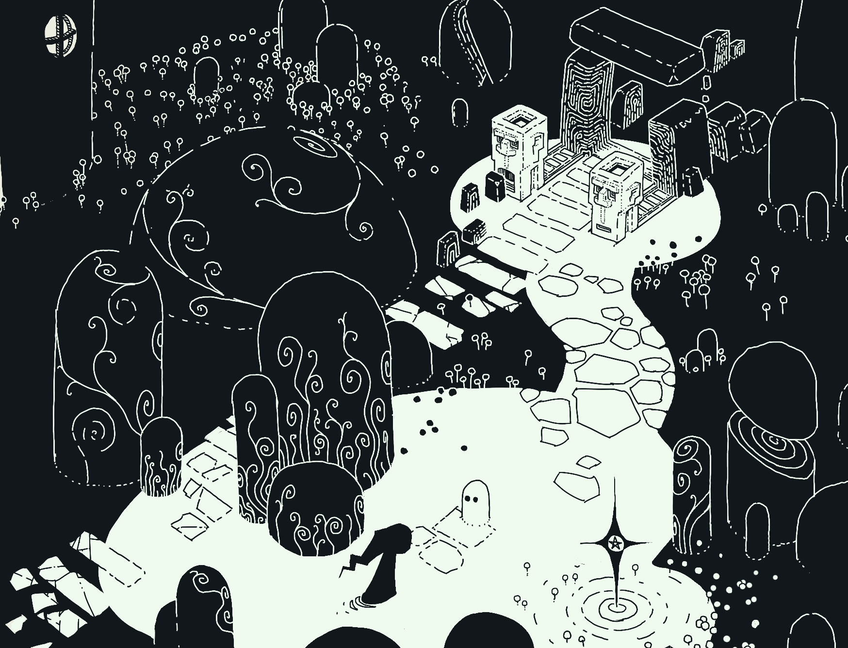
Funny enough, this was just a 1 hour sketch I had done on procreate while toying with new ideas. The main ideas here are pretty clear - high contrast and constand line-weight (read: the lines everywhere are the same thickness)
I chose this style because it fits the needs of the project exactly.
- easy to animate
- easy to create 'hook' screenshots
- low time-cost to create assets
Original Style

Hauntii kind of evolved out of a project that I have been toying around with here and there for years. Originially, the project looked drastically different. It was entirely on a 2D plane, and I originally started it to try out Unity's sweet new tile-grid system. You can see the original style is all grid-based backgrounds and more colorful & cartoony.
Style Variation
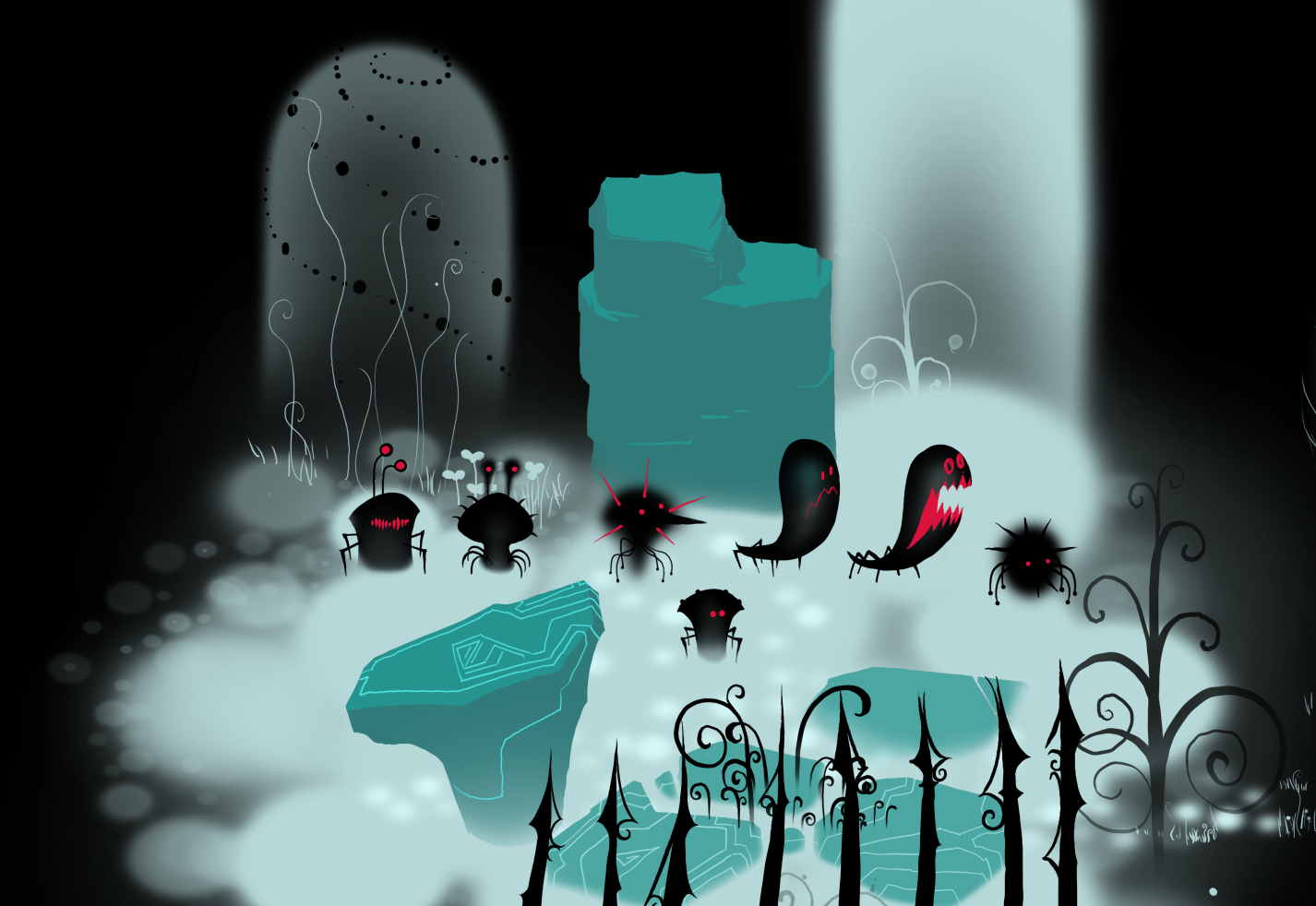
Feeling like that style wouldn't stand out much among the marketplace of indie-games, I opted for another style. This one was a more ethereal, whispy style that I felt fit the theme of the game more.
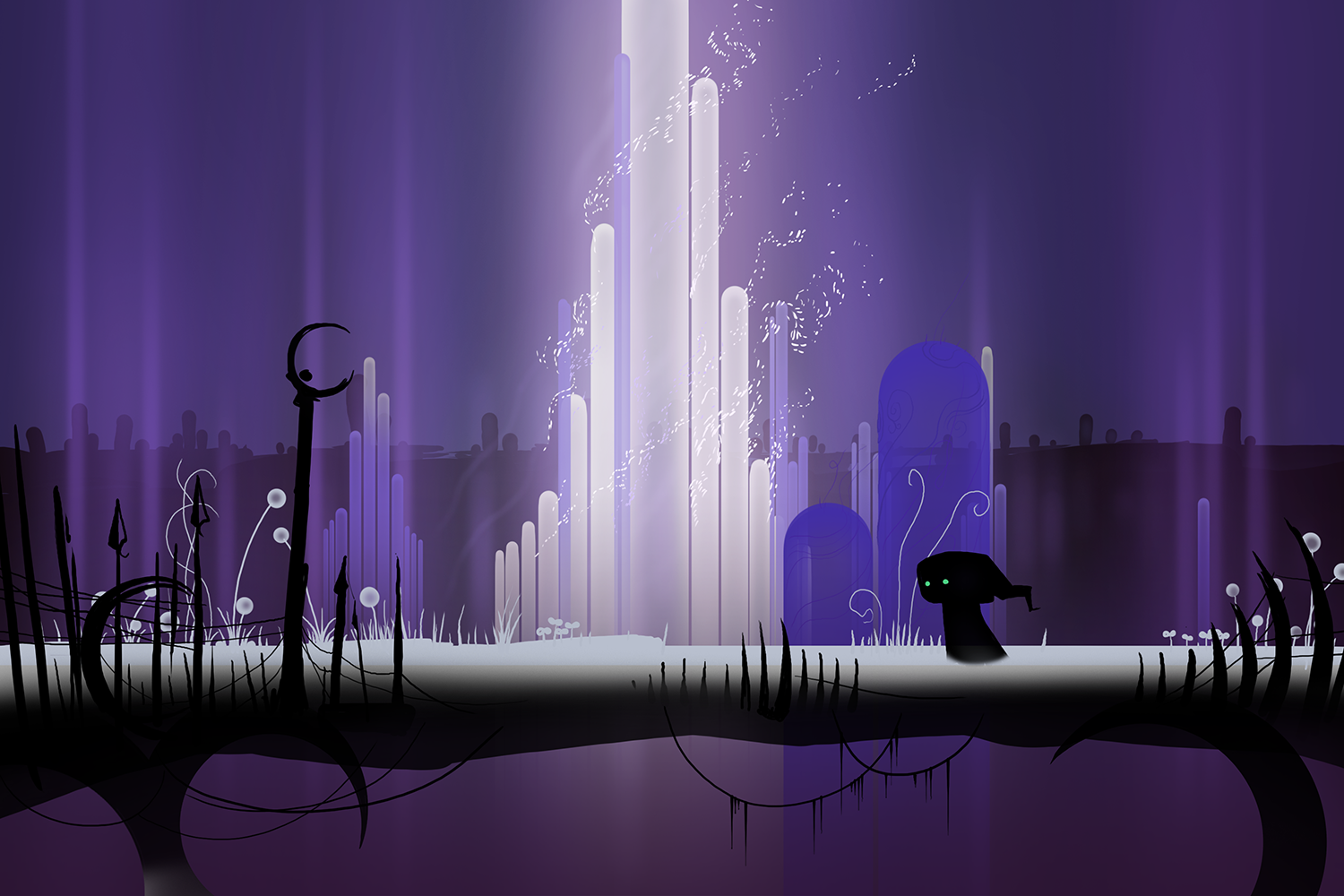
However, I found not having clear limits on how detailed I can get made asset creation pretty time-consuming. It also became difficult to create more complex environments.
Current Style
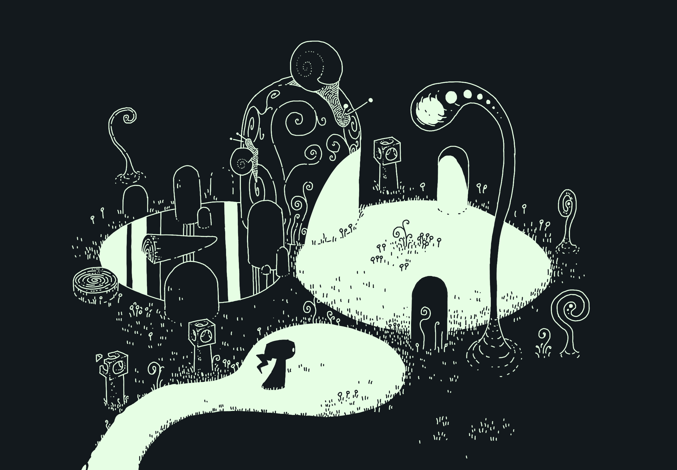
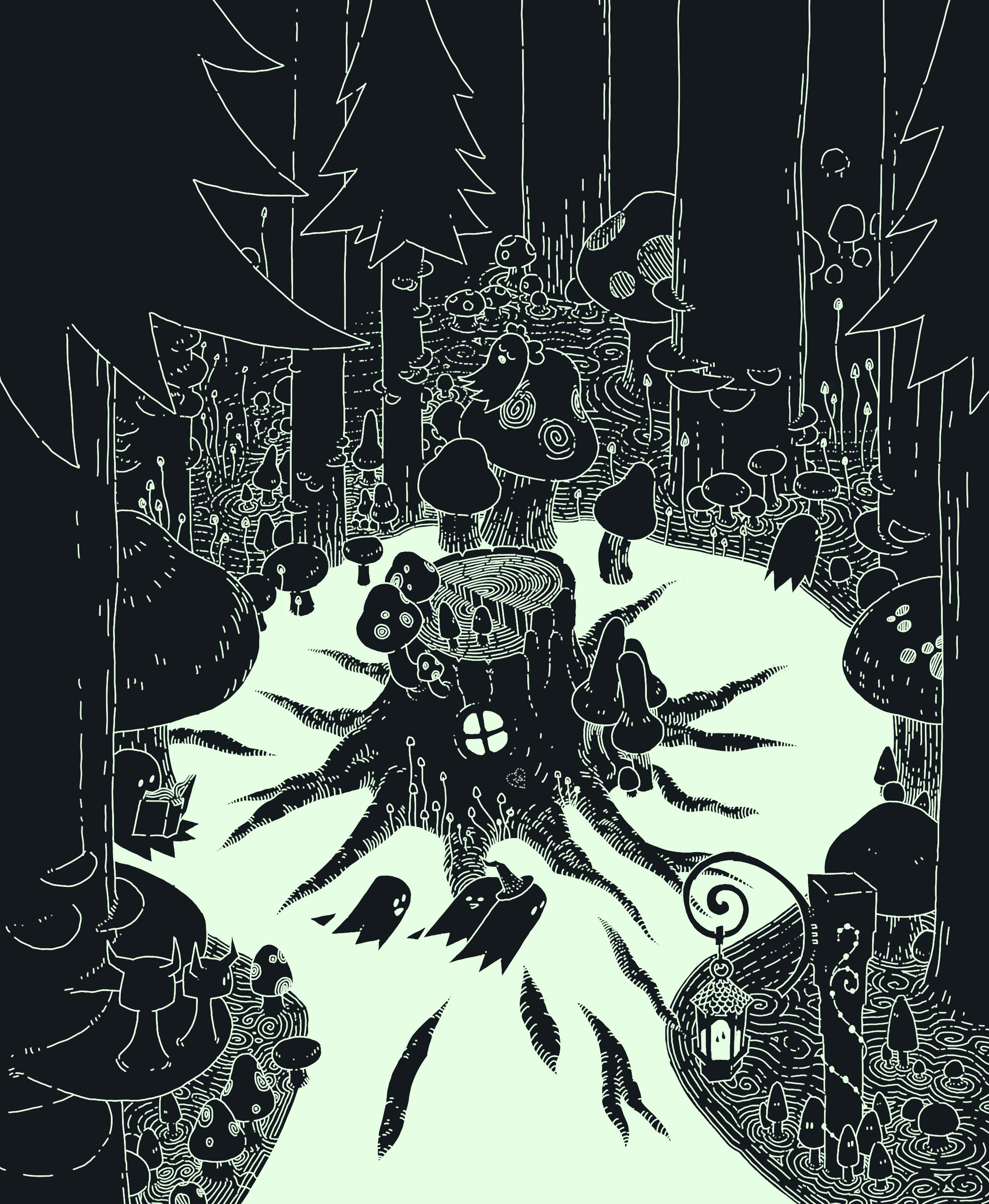
Finally, that takes us to where the game is today. Because this style has very clear boundaries (black & white, constant line-width) I found it very easy to sketch up new concepts. It became like a fun puzzle to put the assets together in Unity. It also has the added benefit of not needing to worry about anything being lit.
Now and then I do find myself looking at the older styles and wondering if I've made the right choice, but I think that's part of development. If you find something that works, have confidence and move forward with it!
Leave a comment
Log in with itch.io to leave a comment.